EV FINANCING PORTAL · CUSTOMER DASHBOARD

EV FINANCING PORTAL · CUSTOMER DASHBOARD

Making EV financing feel clear, guided and reassuring

Making EV financing feel clear, guided and reassuring

Making EV financing feel clear, guided and reassuring

I designed a customer portal that transforms a fragmented back-office financing process into a transparent front-office experience — helping users understand where they are, what to do next, and why waiting moments are still moving forward.

I designed a customer portal that transforms a fragmented back-office financing process into a transparent front-office experience — helping users understand where they are, what to do next, and why waiting moments are still moving forward.

I designed a customer portal that transforms a fragmented back-office financing process into a transparent front-office experience — helping users understand where they are, what to do next, and why waiting moments are still moving forward.

BEEV

BEEV

BEEV

+27%

document completion rate

-34%

support requests about status

-22%

time to first upload

+19%

task completion from dashboard

4.5/5

perceived clarity score

Role: Product Designer

Scope: UX research, IA, dashboard, UI

Industry: EV financing / mobility

Methods: interviews, support review, journey audit

Dashboard mockup

Dashboard mockup

Dashboard mockup

Laptop / tablet slot

Drop laptop dashboard mockup here

Drop laptop dashboard mockup here

The challenge

The challenge

The financing journey was operationally complex but needed to feel simple for end users. Customers had to understand the current stage of their request, know which actions were expected from them, upload the right supporting documents, track progress over time and stay reassured while waiting for the next step.

The financing journey was operationally complex but needed to feel simple for end users. Customers had to understand the current stage of their request, know which actions were expected from them, upload the right supporting documents, track progress over time and stay reassured while waiting for the next step.

The main challenge was to transform a fragmented back-office process into a clear and guided front-office experience.

The main challenge was to transform a fragmented back-office process into a clear and guided front-office experience.

Research signals

Research signals

10

10

customer interviews

5

5

stakeholder interviews

150

150

support conversations reviewed

7

7

platforms benchmarked

1 in 3

1 in 3

expected more proactive updates

48% of users were unsure what to do after submitting their financing request.

44% of support questions were related to status visibility or next steps.

39% of users hesitated when asked to upload supporting documents.

Users expected reassurance during waiting periods, not silence.

PROBLEM

The experience was not only about completing tasks — it was about reducing uncertainty.

The experience was not only about completing tasks — it was about reducing uncertainty.

Users needed a clear overview of the full journey, a simple way to prioritize next actions, continuous reassurance during low-activity phases and transparent document management with explicit statuses.

Users needed a clear overview of the full journey, a simple way to prioritize next actions, continuous reassurance during low-activity phases and transparent document management with explicit statuses.

Design strategy

Design strategy

01

Make the journey visible

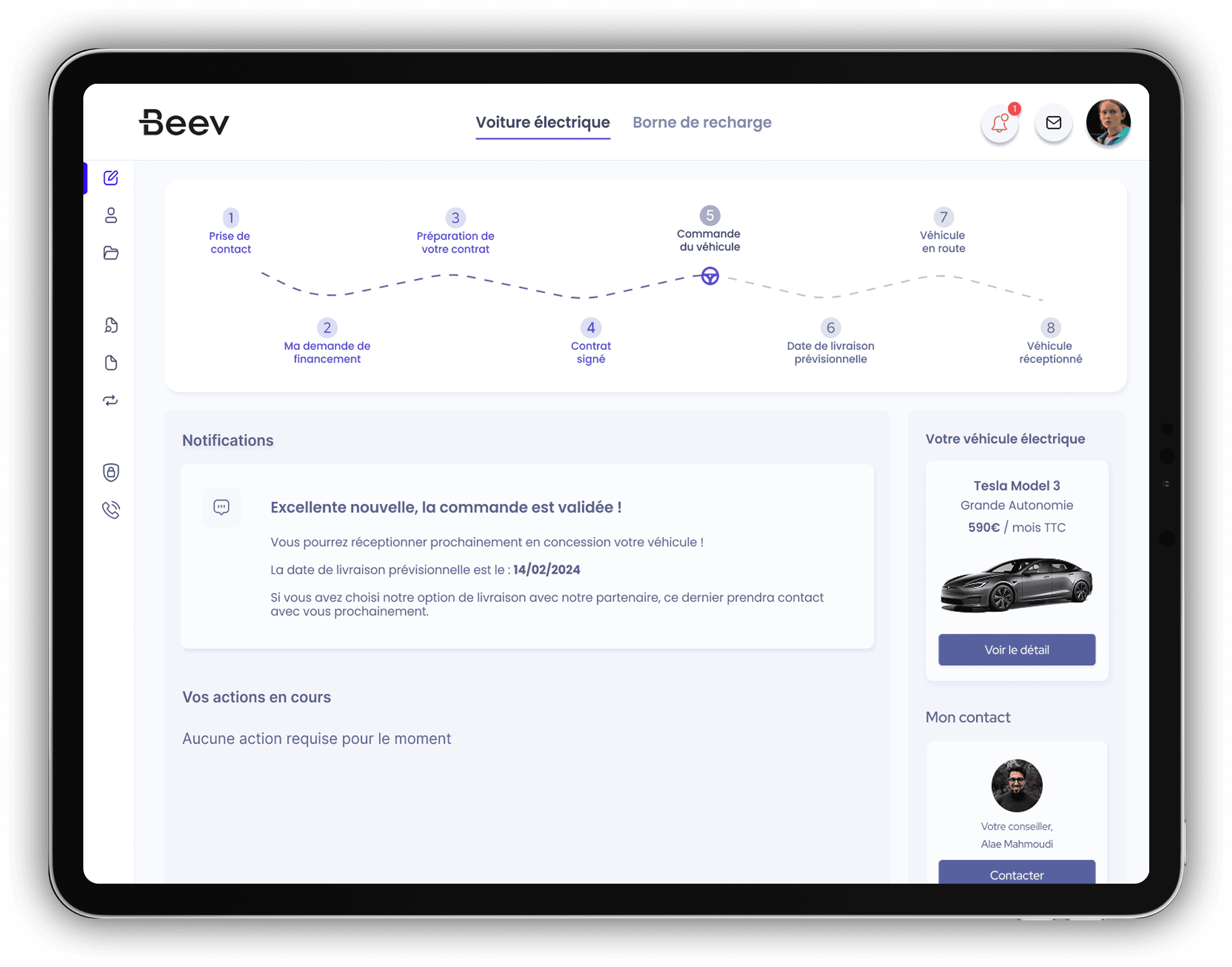
A progress timeline shows the major milestones of the financing lifecycle, from first contact to vehicle delivery.

02

Turn ambiguity into action

The dashboard highlights only what matters now: pending actions, submitted items, offers to review, or appointments to manage.

03

Reduce anxiety while waiting

Contextual notification cards explain what is happening behind the scenes instead of leaving users in silence.

04

Make documents manageable

The document area becomes a guided checklist with progress tracking, clear status chips and file-level actions.

Solution

Solution

A dashboard built around customer reassurance

A dashboard built around customer reassurance

The homepage acts as a control center, giving users an immediate understanding of where they are, what actions remain, who to contact and what updates have occurred.

Financing lifecycle

● First contact

● Financing request

● Contract preparation

○ Vehicle order

○ Delivery planning

Priority actions

Upload supporting documents

2/5

Review available offers

New

Tablet flow mockup

Use this slot for a customer journey tablet view or document checklist screen.

Laptop detail mockup

Use this slot for a financing status detail, offer comparison, or admin-facing view.

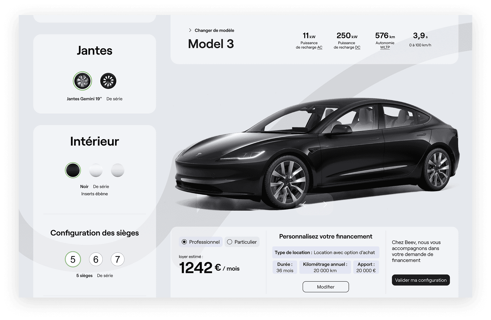
A more transparent document upload flow — mandatory vs optional documents, progress counters, upload CTAs for each item, status pills and expandable file details.

Contextual communication replaces passive waiting with state-based notification cards for dossier review, offers available, approved financing, contract preparation, vehicle ordered and delivery confirmed.

Impact

Impact

+27% increase in document completion rate

+27% increase in document completion rate

-34% fewer support requests about status

-34% fewer support requests about status

4.5/5 perceived clarity score

4.5/5 perceived clarity score

Metrics based on prototype testing, support analysis and anonymized concept data.

What I contributed

What I contributed

Journey mapping

UX research synthesis

Dashboard information architecture

Stepper and lifecycle design

Document upload experience

State-based notifications

Component and interaction design

High-fidelity UI prototypes

Key takeaway

Key takeaway

This project shows my ability to turn a complex operational workflow into a user-centered product experience. By combining status visibility, task prioritization, progress tracking and reassuring communication, I designed a portal that helps customers move through a high-stakes financing journey with more confidence and less friction.

This project shows my ability to turn a complex operational workflow into a user-centered product experience. By combining status visibility, task prioritization, progress tracking and reassuring communication, I designed a portal that helps customers move through a high-stakes financing journey with more confidence and less friction.

Next project

Let's Connect

Feel free to contact me if having any questions. I'm available for new projects or just for chatting.

@ chanelle pinquier

Let's Connect

Feel free to contact me if having any questions. I'm available for new projects or just for chatting.

@ chanelle pinquier

Let's Connect

Feel free to contact me if having any questions. I'm available for new projects or just for chatting.

@ chanelle pinquier