Senior Product Designer · Health insurance mobile app
Senior Product Designer · Health insurance mobile app

Health claims, made easier to submit
Health claims, made easier to submit
Health claims, made easier to submit
I redesigned a mobile health claim flow to help insured members submit claims faster, with fewer errors and more confidence : from selecting the right patient to uploading a readable proof of care.
I redesigned a mobile health claim flow to help insured members submit claims faster, with fewer errors and more confidence : from selecting the right patient to uploading a readable proof of care.
I redesigned a mobile health claim flow to help insured members submit claims faster, with fewer errors and more confidence : from selecting the right patient to uploading a readable proof of care.
+28%
+28%
successful claim completion
successful claim completion
-34%
-34%
incomplete submissions
incomplete submissions
-26%
-26%
document-quality issues
document-quality issues
4.6/5
4.6/5
clarity score in prototype testing
clarity score in prototype testing
Based on usability testing.
Role: Product Designer
Role: Product Designer
Scope: UX, UI, interaction design, mobile prototype
Scope: UX, UI, interaction design, mobile prototype
Industry: Health insurance / Insurtech
Industry: Health insurance / Insurtech
Platform: iOS mobile app
Platform: iOS mobile app
Methods: User interviews, support ticket review, usability testing, UX audit
Methods: User interviews, support ticket review, usability testing, UX audit
Context
Context
Context
Submitting a health claim is usually a high-friction moment. Users need to select the right beneficiary, identify the right care category, upload a readable document and trust that their claim will be processed correctly.
Submitting a health claim is usually a high-friction moment. Users need to select the right beneficiary, identify the right care category, upload a readable document and trust that their claim will be processed correctly.
Submitting a health claim is usually a high-friction moment. Users need to select the right beneficiary, identify the right care category, upload a readable document and trust that their claim will be processed correctly.
The goal was to transform an administrative task into a guided mobile journey that feels simple, structured and reassuring.
The goal was to transform an administrative task into a guided mobile journey that feels simple, structured and reassuring.
The goal was to transform an administrative task into a guided mobile journey that feels simple, structured and reassuring.
Research signals
Research signals
8
8
user interviews with policyholders
user interviews with policyholders
12
12
usability tests on the existing flow
usability tests on the existing flow
120
120
anonymized support tickets reviewed
anonymized support tickets reviewed
6
6
insurance and banking mobile apps benchmarked
insurance and banking mobile apps benchmarked
42% of tested users hesitated when choosing the right health category.
42% of tested users hesitated when choosing the right health category.
37% were unsure if their uploaded document was readable enough.
37% were unsure if their uploaded document was readable enough.
31% of support tickets were related to missing, blurry or incorrect documents.
31% of support tickets were related to missing, blurry or incorrect documents.
1 in 4 users submitting for dependents were unsure whose claim they were creating.
1 in 4 users submitting for dependents were unsure whose claim they were creating.
Problem
Problem
The previous experience treated claim submission like a form. Users needed a guided decision-making flow.
The previous experience treated claim submission like a form. Users needed a guided decision-making flow.
The previous experience treated claim submission like a form. Users needed a guided decision-making flow.
Too many decisions at once
Too many decisions at once
Lack of confidence after each selection
Lack of confidence after each selection
High risk of incorrect or unreadable documents
High risk of incorrect or unreadable documents
Design strategy
Design strategy
One decision per screen
One decision per screen
One decision per screen
The flow was split into simple steps: patient, category, care need and document upload.
The flow was split into simple steps: patient, category, care need and document upload.
The flow was split into simple steps: patient, category, care need and document upload.
Clear feedback after every action
Clear feedback after every action
Clear feedback after every action
Selected cards, active CTAs and summary chips help users understand what they selected.
Selected cards, active CTAs and summary chips help users understand what they selected.
Selected cards, active CTAs and summary chips help users understand what they selected.
Prevent errors before submission
Prevent errors before submission
Prevent errors before submission
Disabled CTAs and document preview reduce the chance of incomplete or poor-quality claims.
Disabled CTAs and document preview reduce the chance of incomplete or poor-quality claims.
Disabled CTAs and document preview reduce the chance of incomplete or poor-quality claims.
Solution
Solution
A guided claim journey that makes every step feel certain.
A guided claim journey that makes every step feel certain.
A guided claim journey that makes every step feel certain.
The redesigned flow replaces a dense form with progressive disclosure, clear selected states, document preview and lightweight summaries throughout the journey.
The redesigned flow replaces a dense form with progressive disclosure, clear selected states, document preview and lightweight summaries throughout the journey.
Patient-first claim creation
Patient-first claim creation
Visual category selection
Visual category selection
Persistent choice summary
Persistent choice summary
Document capture and preview
Document capture and preview
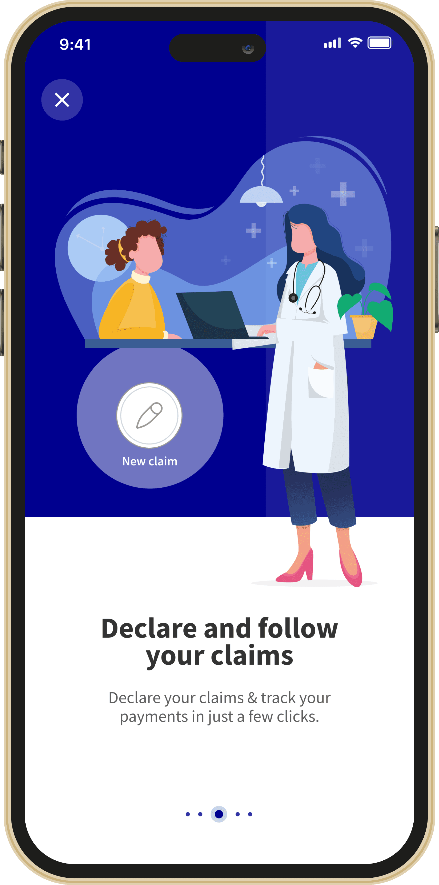


Patient-first claim creation. The journey starts by asking who the claim is for, reducing ambiguity for family accounts.
Visual category selection. Large category cards make dental, vision, outpatient and pharmacy easier to scan.
Persistent choice summary. Selected choices appear as chips near the page title, confirming progress.
Document capture and preview. Users can take a picture or choose one, then preview before continuing.
Interaction details
Interaction details
The interaction system was designed to reduce uncertainty. Every state gives users immediate feedback and prevents them from moving forward before the required information is complete.
The interaction system was designed to reduce uncertainty. Every state gives users immediate feedback and prevents them from moving forward before the required information is complete.
The interaction system was designed to reduce uncertainty. Every state gives users immediate feedback and prevents them from moving forward before the required information is complete.
Default state
Default state
Selected state
Selected state
Disabled CTA
Disabled CTA
Active CTA
Active CTA
Summary chips
Summary chips
Document preview
Document preview
Impact
Impact
+28% increase in successful claim completion
+28% increase in successful claim completion
+28% increase in successful claim completion
-34% fewer incomplete submissions
-34% fewer incomplete submissions
-34% fewer incomplete submissions
-41% fewer users hesitating on category selection
-41% fewer users hesitating on category selection
-41% fewer users hesitating on category selection
-26% fewer document-quality issues
-26% fewer document-quality issues
-26% fewer document-quality issues
18 seconds faster to reach document upload
18 seconds faster to reach document upload
18 seconds faster to reach document upload
4.6/5 clarity score, compared to 3.1/5 before
4.6/5 clarity score, compared to 3.1/5 before
4.6/5 clarity score, compared to 3.1/5 before
Measured during moderated prototype testing with representative users.
What I contributed
What I contributed
Journey mapping
Journey mapping
Research synthesis
Research synthesis
UX flows
UX flows
High-fidelity UI
High-fidelity UI
Interaction patterns
Interaction patterns
Mobile prototype
Mobile prototype
Usability testing
Usability testing
Design system components
Design system components
Final takeaway
Final takeaway
Final takeaway
This project shows how a complex insurance workflow can be made simpler through progressive disclosure, clear feedback, error prevention and mobile-first interaction design. The result is a claim experience that feels less administrative, more guided and easier to complete.
This project shows how a complex insurance workflow can be made simpler through progressive disclosure, clear feedback, error prevention and mobile-first interaction design. The result is a claim experience that feels less administrative, more guided and easier to complete.
This project shows how a complex insurance workflow can be made simpler through progressive disclosure, clear feedback, error prevention and mobile-first interaction design. The result is a claim experience that feels less administrative, more guided and easier to complete.
Next project